Brand identity · Case study
Brisbane Olympics (2026)
A production case study for UCSD Adwave — a full branding system for the Brisbane 2032 Summer Olympic Games, from identity research through out-of-home and ticket applications.
- Role
- Brand & campaign design
- Year
- 2026
- Context
- UCSD Adwave production
- Deliverables
- Logo, billboard, tickets
Overview
This project explores what a Brisbane Summer Olympics could look and feel like — set against the alpine, editorial tone of French Alps 2030. The direction needed to feel natural, dynamic, and atmospheric: rooted in the Brisbane River, community rhythm, and the kinetic energy of track and aquatics.
The system centers on a kangaroo-to-athlete motion narrative — Australia's native symbol transforming into human performance — carried through logo lockups, a “Bound for Gold” out-of-home campaign, and event tickets designed for a multicultural, community-forward host city.
Discovery & planning
Early planning mapped research areas, thematic keywords, and deliverables: logo, merchandise, ticket stub, billboards, and transit/social applications. Two concept threads anchored the work — sports motion and river systems — with track & field and aquatics as primary sport references.
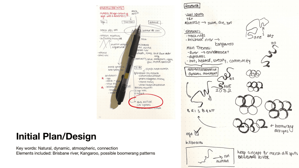
- Keywords: natural, dynamic, atmospheric, connection, ripple, glow, rhythm.
- Motifs: Brisbane River, kangaroo silhouette, boomerang ring patterns.
- Research: Brisbane climate, Indigenous history, urban infrastructure, and Olympic precedent.
Logo research
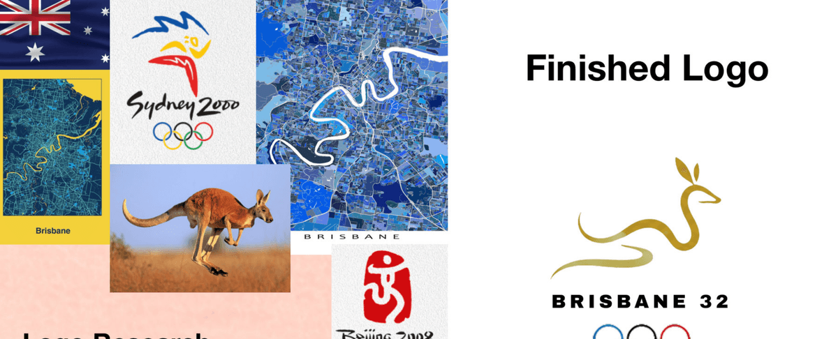
Logo research pulled from Olympic history, Brisbane geography, and Australian symbolism — looking for a mark that could stand alone while feeling fluid and place-specific.
- Center the Brisbane River — a defining feature of the city and a focus of pre-Games ecological investment in Southeast Queensland.
- Study past Games marks for simplicity and standalone clarity; Sydney 2000 informed palette and ring treatment.
- Combine kangaroo form with river curvature in a single continuous line.
Logo system
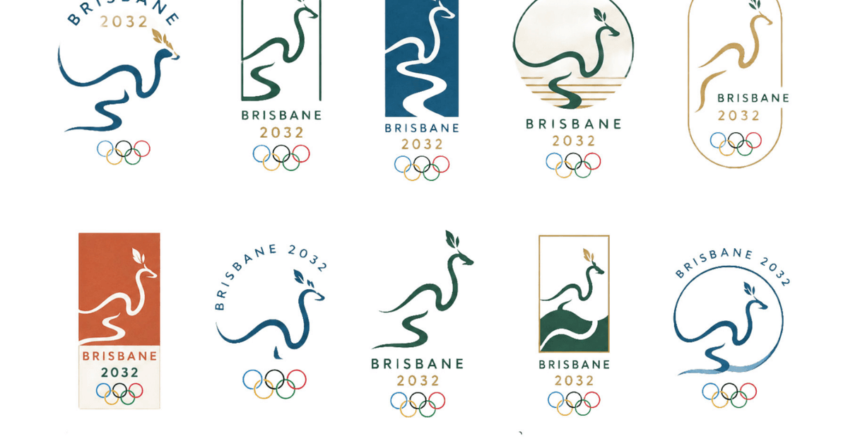
Ten lockup directions tested framing devices, colorways, and typographic arrangements — from arch and stadium silhouettes to circular badges and stacked wordmarks.
Out-of-home campaign
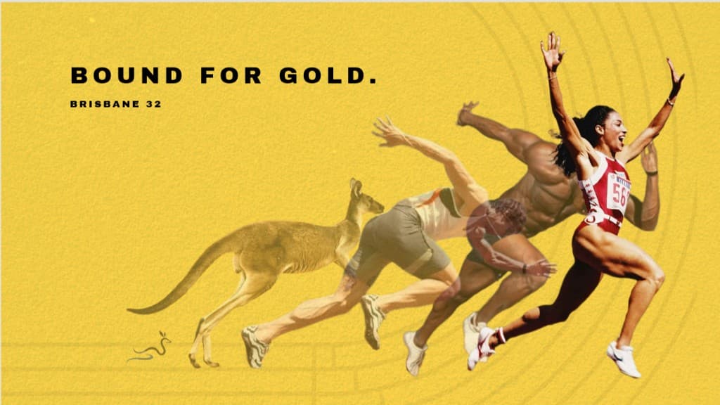
The “Bound for Gold” billboard extends the identity into campaign space — gold field, subtle track texture, and a sequential transition from kangaroo to sprinter built from the logo's motion logic.
- Headline ties directly to the kangaroo theme and medal ambition.
- Logo mark opens the sequence; athletes resolve into full stride at the right edge.
- Warm gold palette codes the work as unmistakably Australian summer.
Ticket research
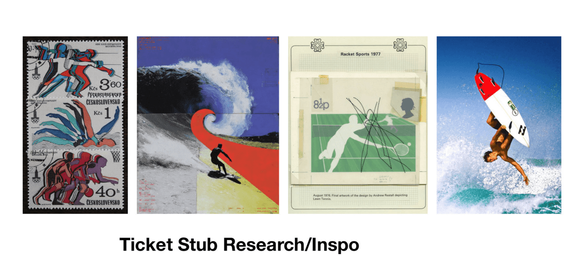
Ticket concepts drew from vintage sport graphics, surf culture, and Brisbane's demographic character — one of Australia's most multicultural cities, shaped by migration from Asia, the Middle East, Africa, and the Pacific Islands.
Event tickets
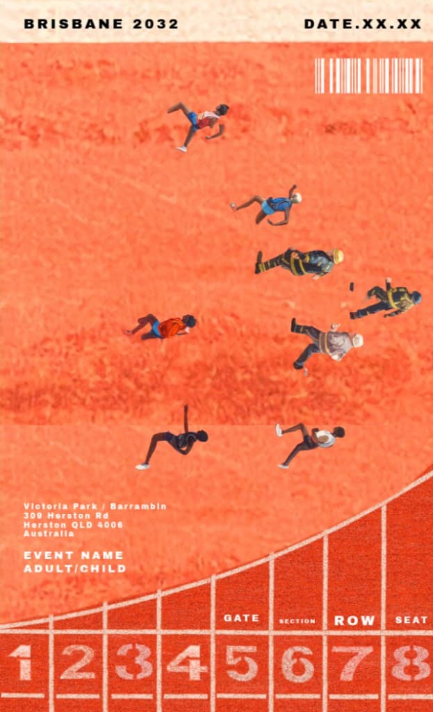
Finished stubs apply the rising “up” motif from the track campaign — community members and first responders run alongside athletes. Track & field uses outback rock texture; aquatics uses lane geometry from above.
- Shared header: Brisbane 2032 wordmark, date, and barcode.
- Track ticket: textured red-earth field with lane numbers and gate info.
- Aquatics ticket: overhead pool lanes with stadium seating at the base.
- System designed to extend across additional sports.
Tags
- Brand Identity
- Entertainment